Pixel books don’t tell us the whole truth. It was never razor sharp.
I’ve been thinking about the various pixel porn books that have been shooting out of all sorts of corners of the world for a while. Bitmap Books is pretty good at it, here you have the unofficial Mega Drive and Super Nintendo pixel books from electrogamers, winning all the awards in terms of layout. There are countless more of them, almost all of them elaborately and lovingly designed and produced to a high standard.
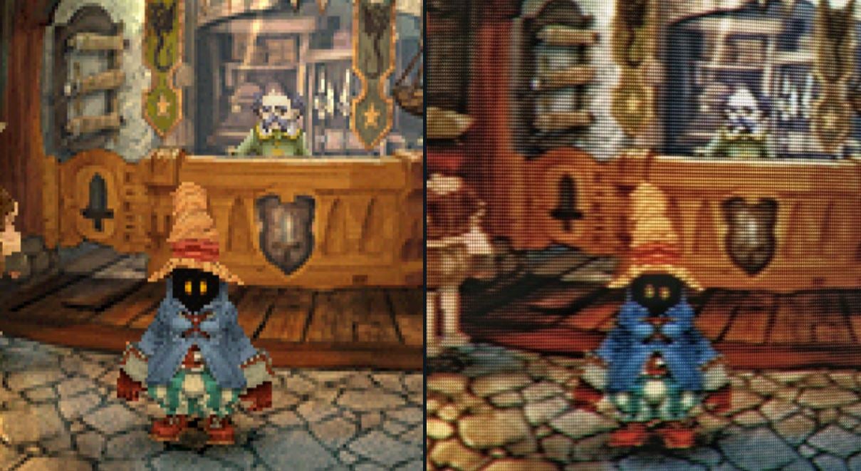
And as chic as I find almost every one of them, there’s something that bothers me. I couldn’t really put my finger on what it was for a long time. The books are lovingly made, the image quality absurdly high, every pixel celebrated in perfect, clear, razor-sharp brilliance.
Well, that’s exactly the problem. It became clear to me when I started playing around with various CRT filters in Photoshop and suddenly the nostalgia euphoria really kicked in. These pixel books show something that was practically non-existent until the second half of the 2000s: well-defined pixels on a flat plane. Until then, tubes were the rage, and CRT screens, even longer in the TV market than in monitors. And they didn’t show the pixels as “clean” but gave them their own coat of paint, sometimes more, sometimes less.
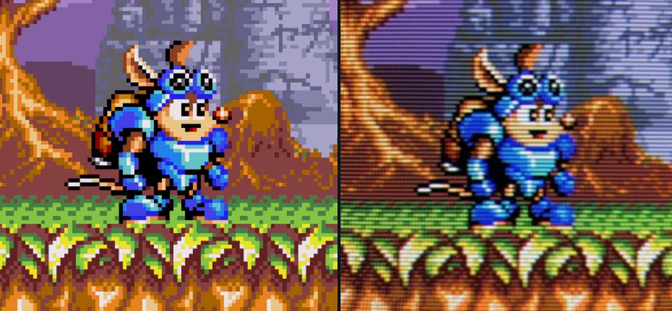
These games, scenes and characters never looked like those books. Not even the developers. A new technique is applied to old material. Remastered if you will. These games are known today, they look like this thanks to emulators, but each of them also has CRT filters. If an emulator has nothing else, it has a CRT filter. Even devices like the Framemeister, which are designed to conjure up the exact look of the Pixel books on modern screens, have umpteen settings for these lines on the screen.
This smearing effect that existed on the CRT screen was not even accidental, but was deliberately used by the developers, as can be seen on the CRT Pixels Twitter can be seen in umpteen examples. If you only have 30 by 30 pixels to represent a face, that’s not much, it always gets angular and rough. But when the ray gun softens and blurs these pixels, and this effect is used in a targeted manner, characters suddenly look much more natural.
I don’t want every pixel shot in a book to have a CRT filter, but a mix would be nice. It would be nice to mix what was actually there – hence the intention of the artist – with what existed in the console’s frame buffer. If it’s collages and interpretations, like the ones used in the pixel books, then it probably doesn’t need to. But seeing the true faces of childhood heroes again when opening a book like this would be nice here and there. I know from my own experience that this effect is very difficult to reproduce, maybe not 100% at all. But that would be an exciting task for the pixel book artists.
![]()
Reference-www.eurogamer.de