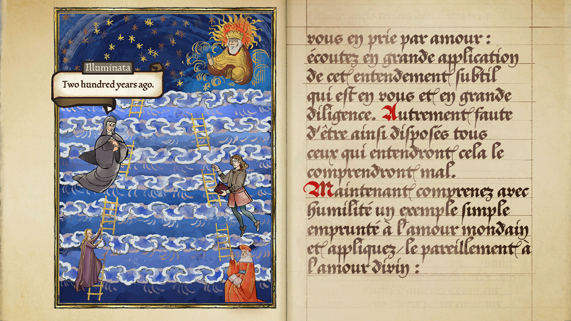
Don’t worry, you’ll be able to read Pentiment’s dialogue without being a manuscript expert


I don’t know about you, but I’m not very good at reading Ye Olde Ynglishe. The letters are all curly, and my vision’s already a bit rubbish to begin with. Like a lot of specialized fonts, I find calligraphy awkward to read at best and virtually illegible at worst. That’s why I always appreciate when games make an effort to make text as accessible as possible. Case in point: Obsidian’s upcoming medieval mystery, Pentiment, which has an option to swtich to easy to read fonts baked in. Verily, thou hast mine thanks.
See, Pentiment’s an adventure game set across 25 years in 16th century Bavaria, and adopts highly stylized graphics that make the whole thing seem like playing a medieval manuscript brought to life. That means a large amount of the game’s text and dialogue are presented in fancy calligraphy appropriate for the time period. Obsidian have shared on Twitter that the choice of stylized or easy read fonts will pop up when you first start playing Pentiment, and you’ll be able to turn it on or off in the settings, too.
I’ve been intrigued to get my history-loving mitts on Pentiment since it was announced at the Xbox & Bethesda Showcase in June. Yet at the back of my mind was the thought that my visual issues would make the game more difficult to dig into. It’s reassuring to know that I can always set it to Easy Read fonts. Accessibility is hugely important, so it’s always pleasing to see efforts such as Disco Elysium’s dyslexia-friendly fonts, Forza Horizon 5’s sign language interpreters, or Obsidian’s fairly straightforward legibility options here.
Easy Read Fonts is an accessibility feature in Pentiment that appears when you start the game. Players can choose between Stylized Fonts or Easy Read Fonts!
The feature can be accessed in the Options menu during your playthrough too.
✒️ Pentiment is available on Nov 15, 2022. pic.twitter.com/VT9ASkAmJs
— Obsidian (@Obsidian) November 2, 2022
Pentiment journeys onto Steam, Microsoft Store and PC Game Pass on November 15th for £15/$20/€20.
Reference-www.rockpapershotgun.com